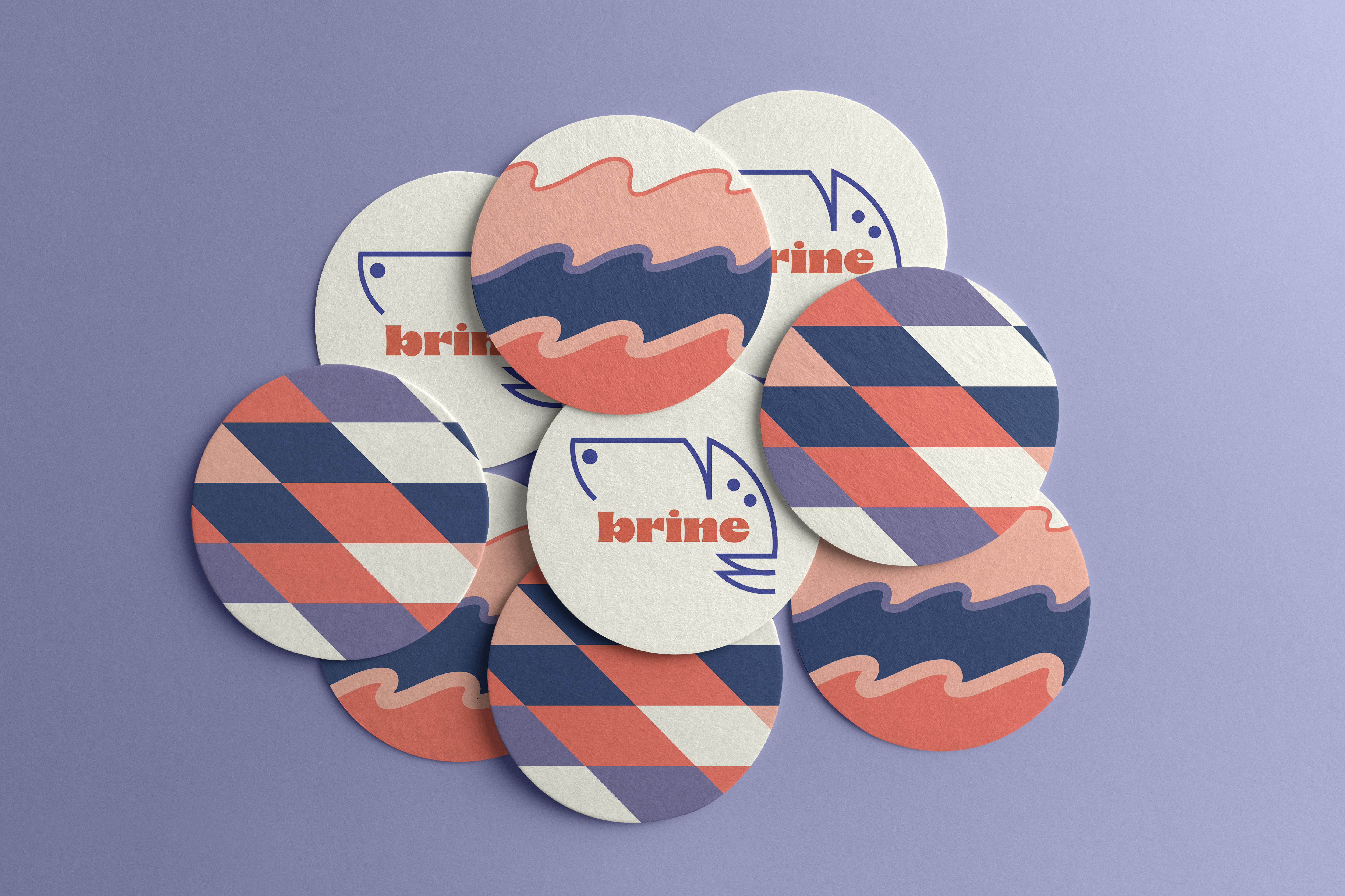
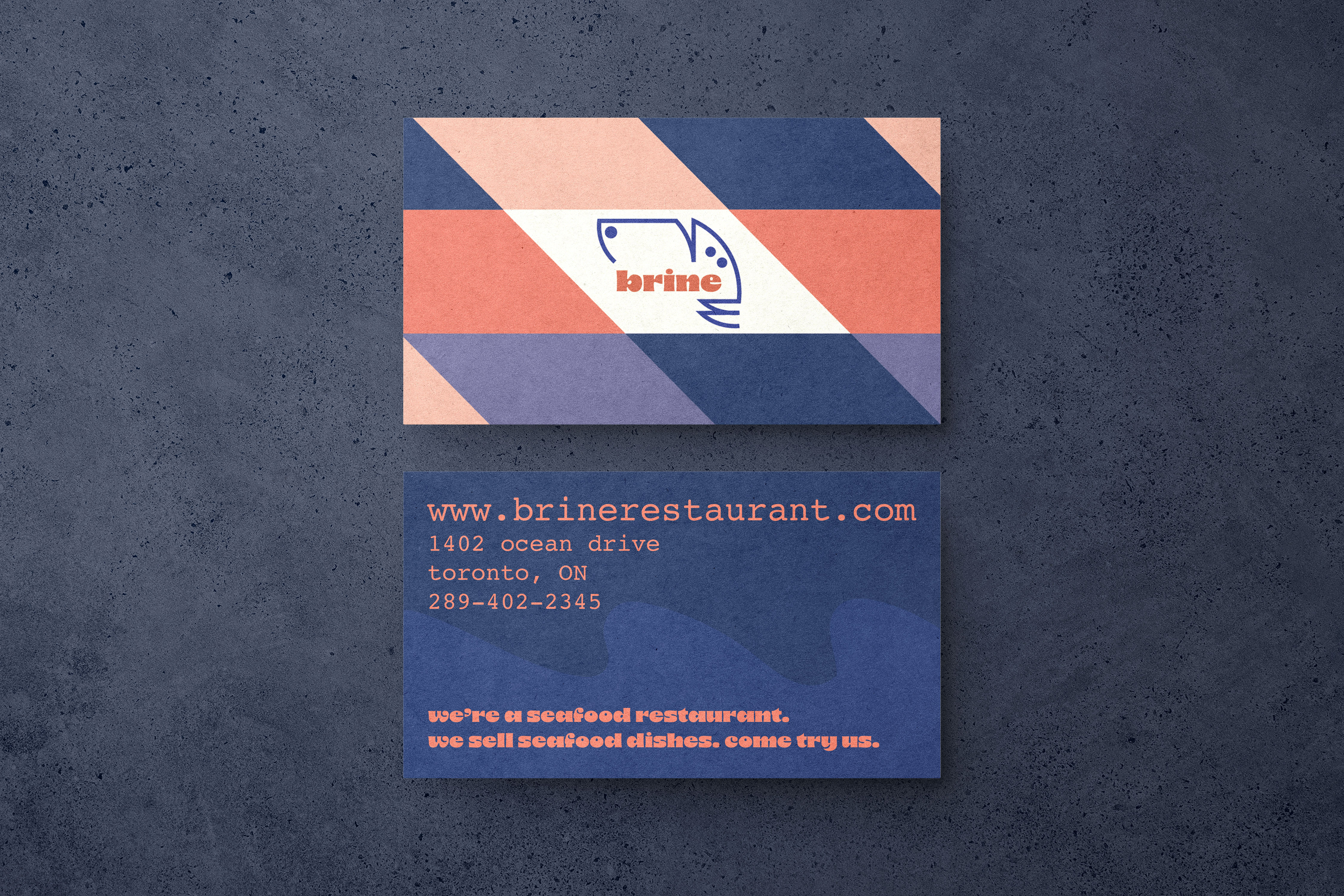
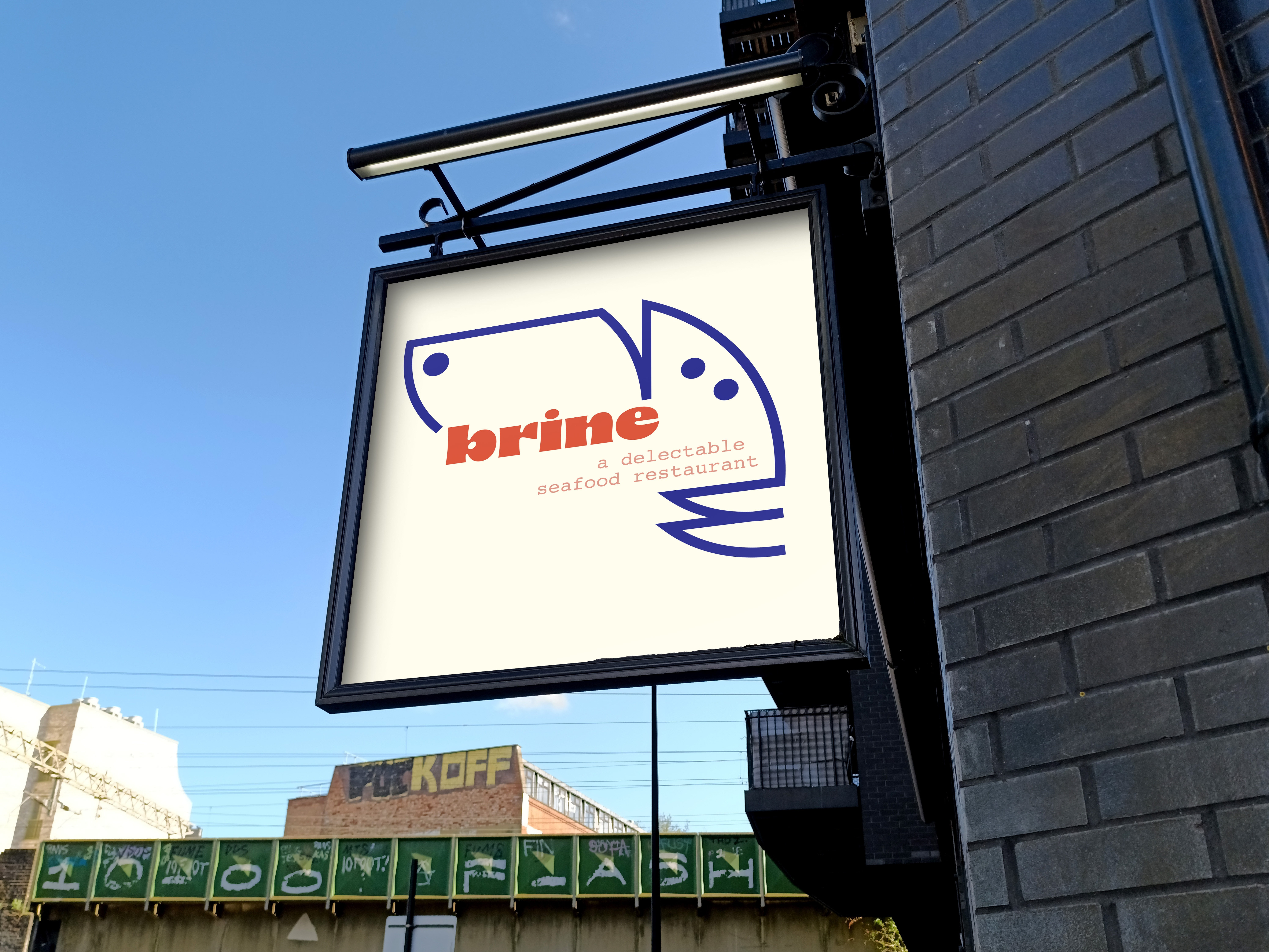
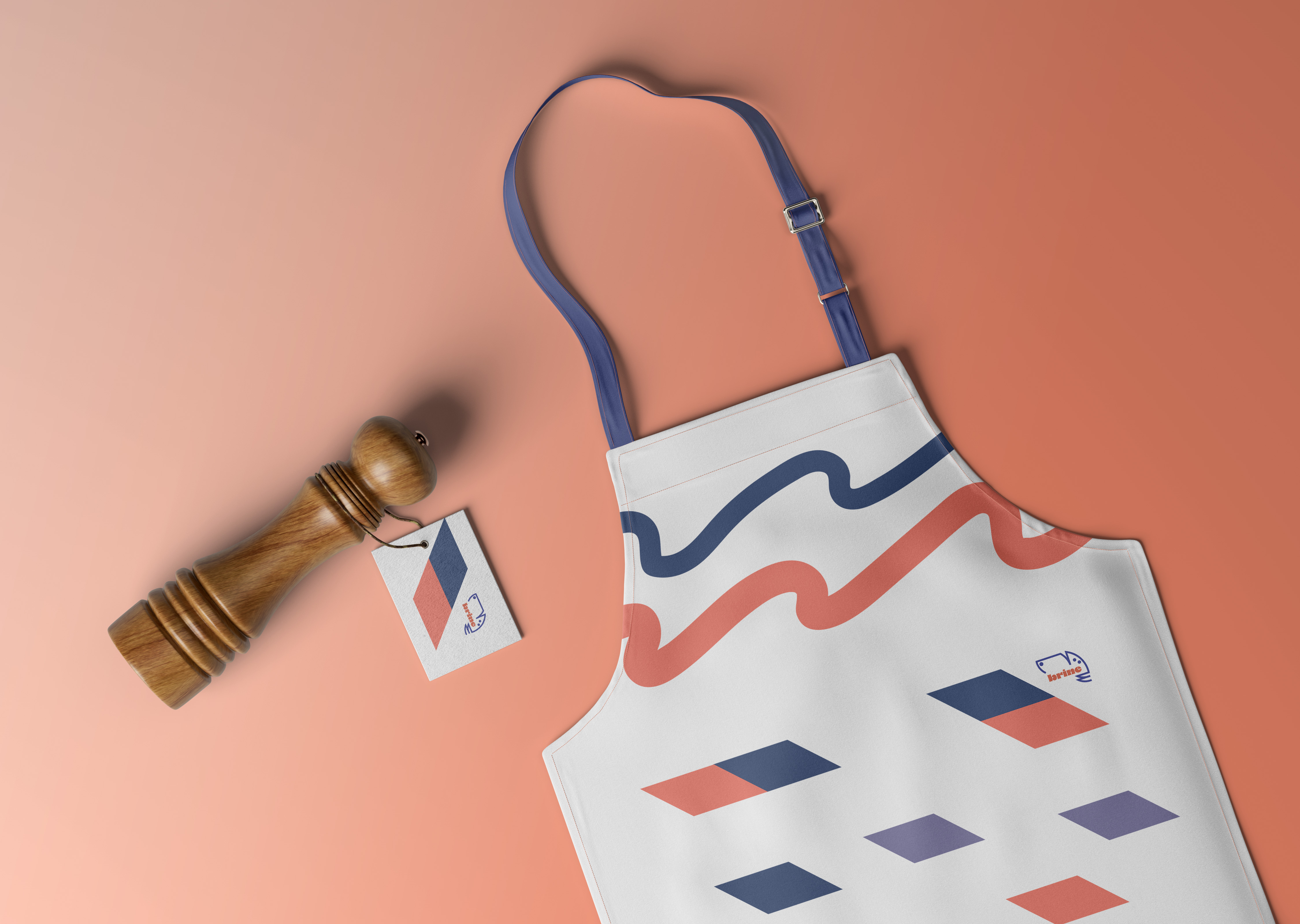
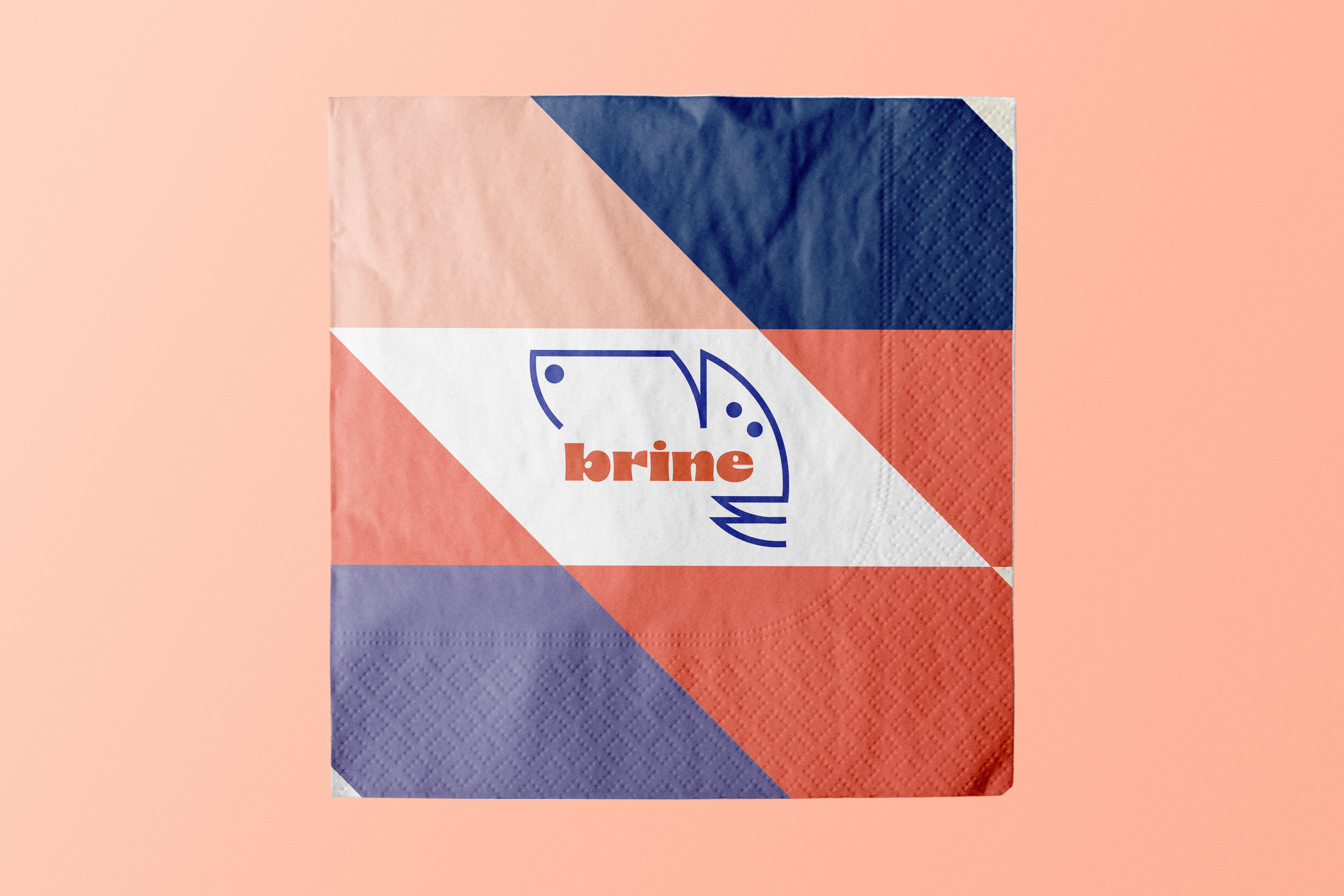
Brine was a brand that came to me after I created the logo. It was an abstract logo I had in my head for days, so I decided to finally design it. When I did, I realized it looked short of like a fish merged with a squid. So, from there, I decided that this logo would work best for a quirky seafood restaurant.
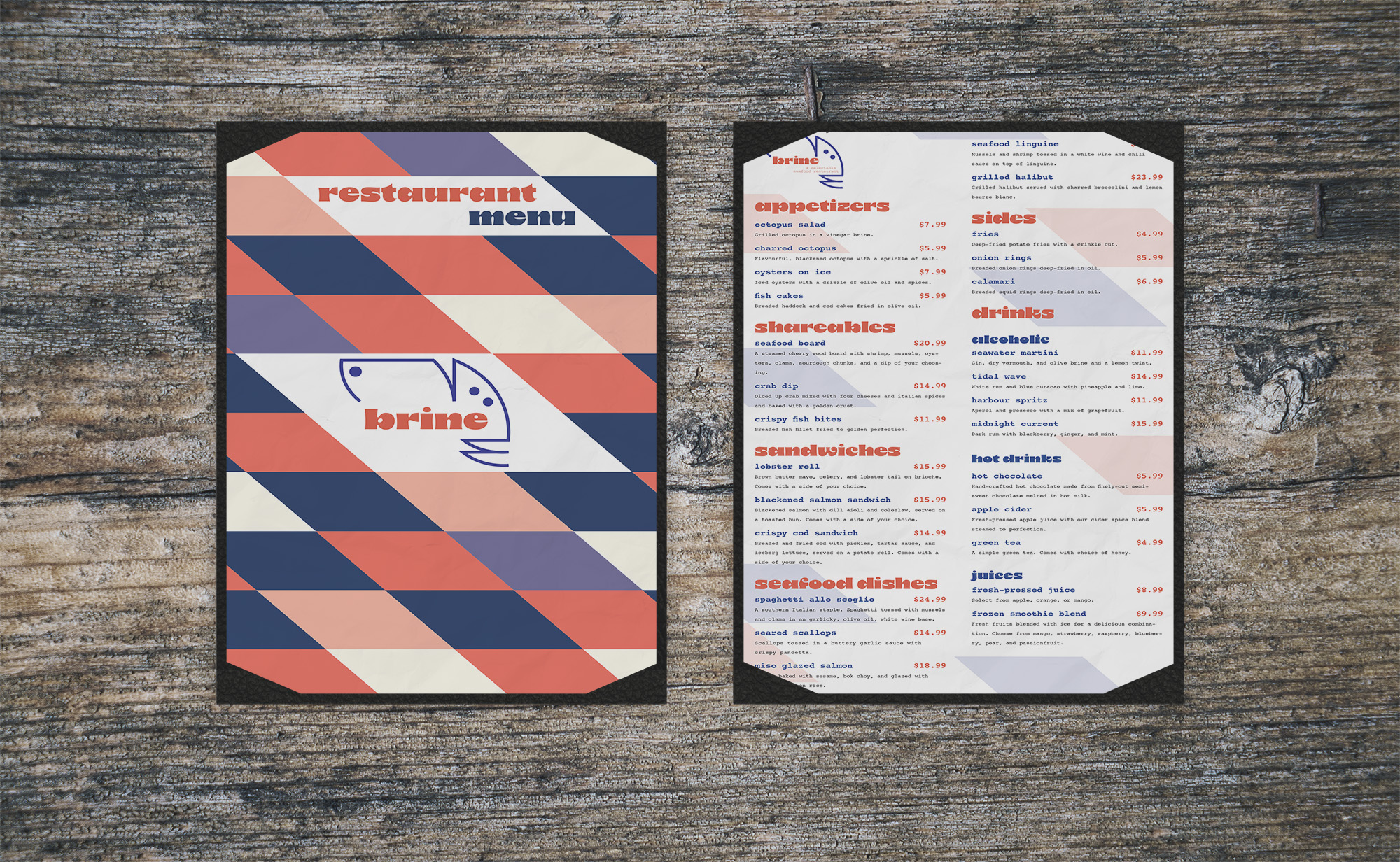
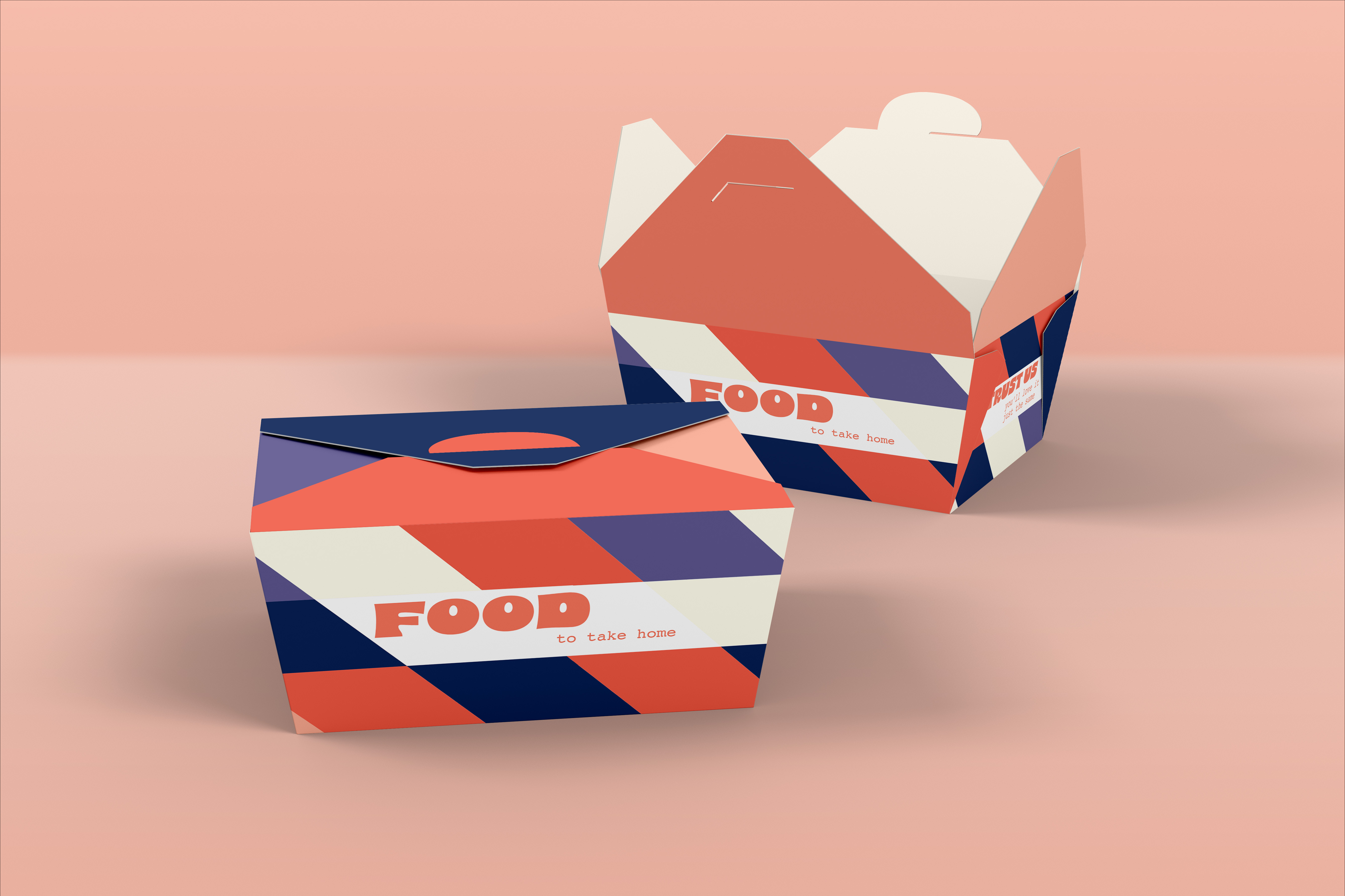
The bold aquatic colour scheme is pulled from coral and the oceans, and it's meant to make the company stand out more.
I've never designed a restaurant like this, so it was fun creating all the assets to really sell the brand.
EVIDENCE:
"Brine brings a twist to dining. It's posh, but also fun."
VERDICT:
I had a blast designing this brand, and I think it'll inspire more like it in my portfolio.

.png)

