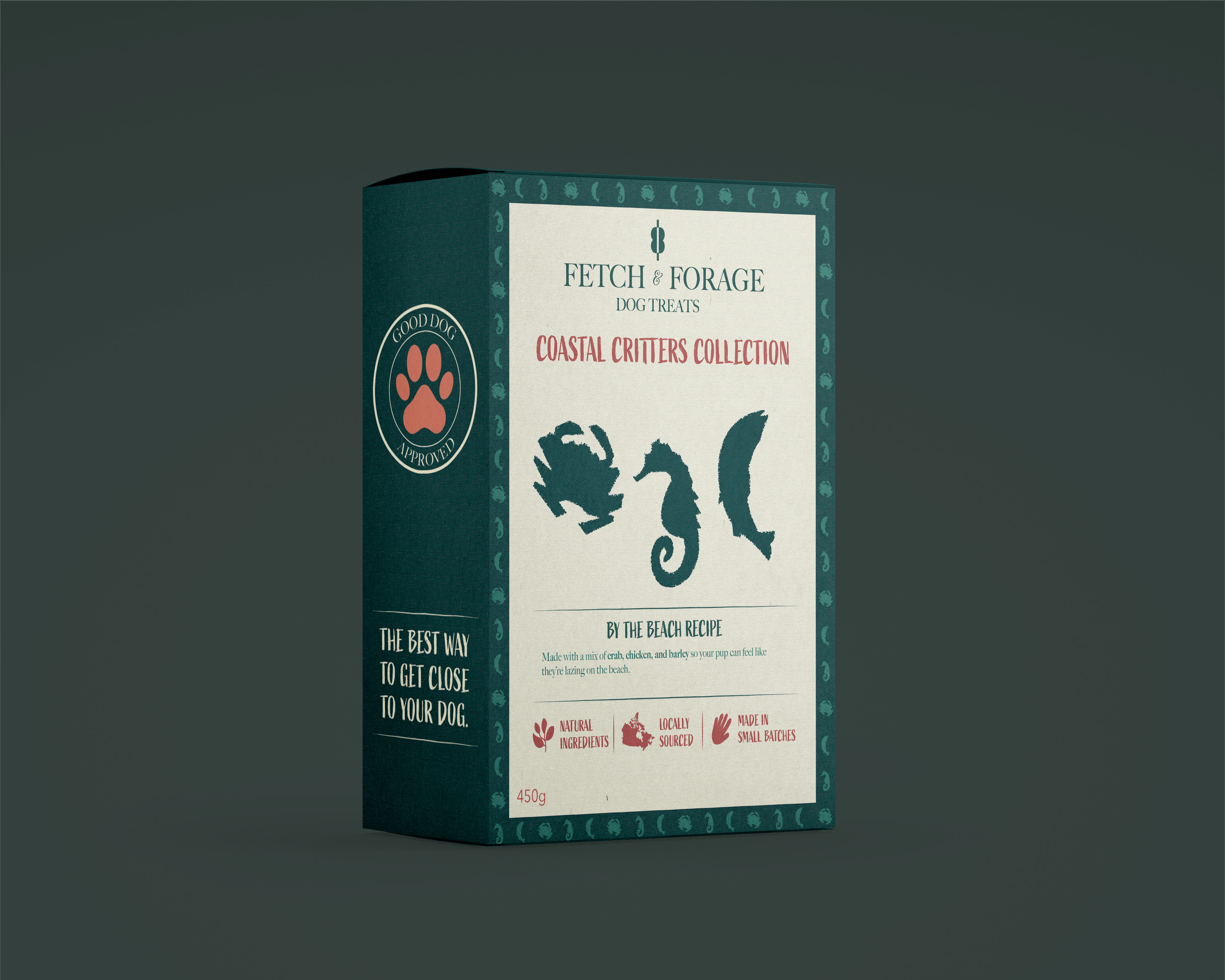
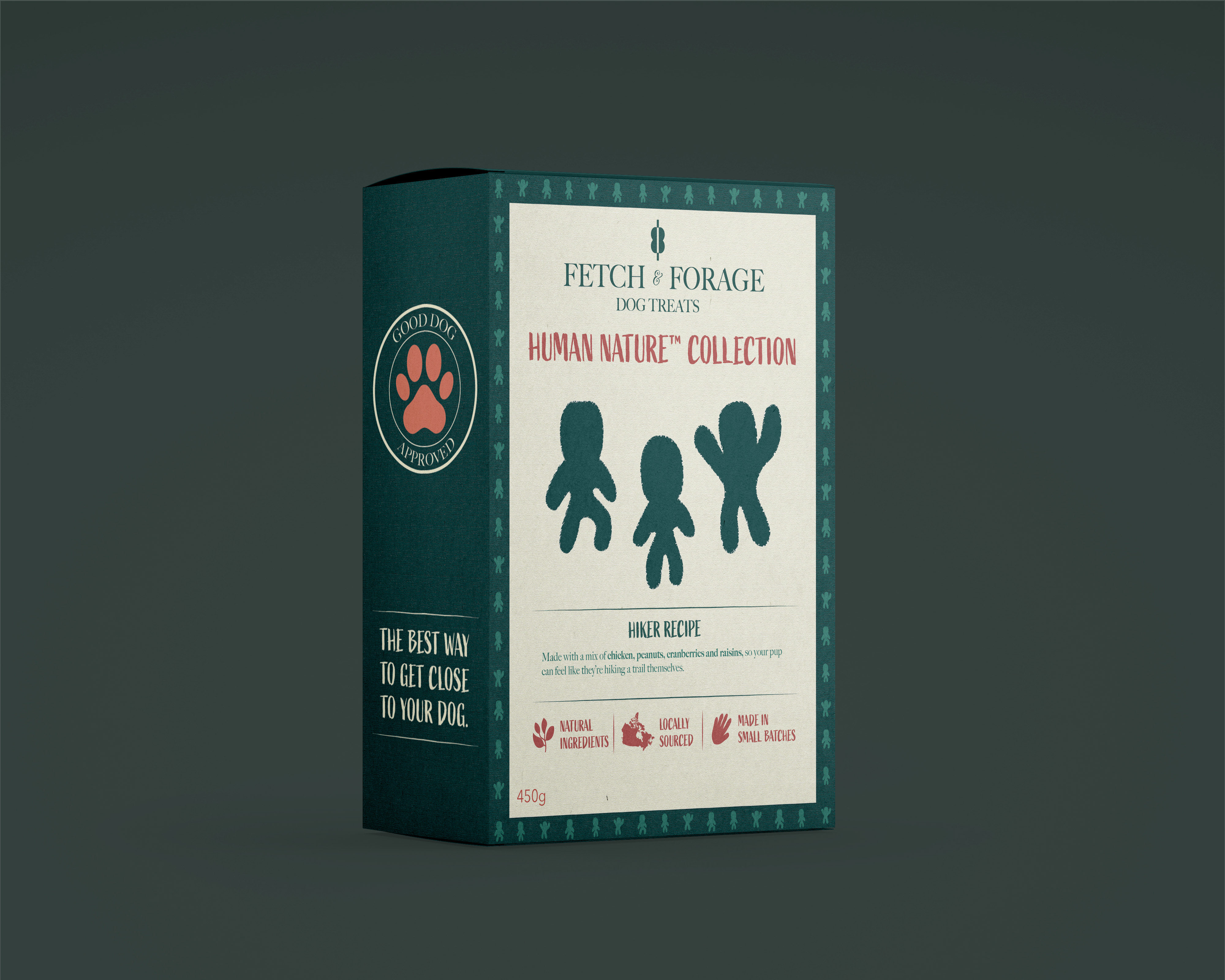
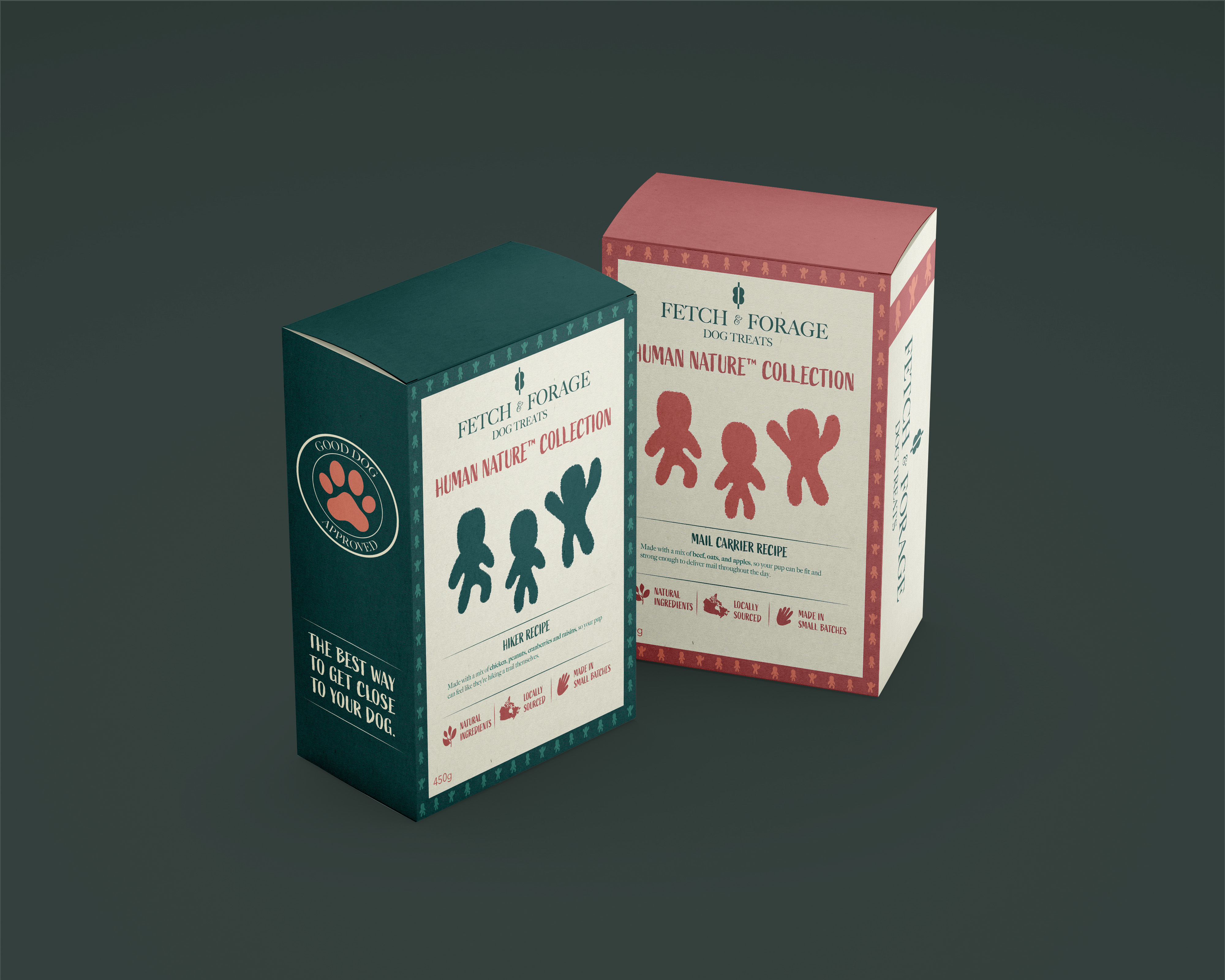
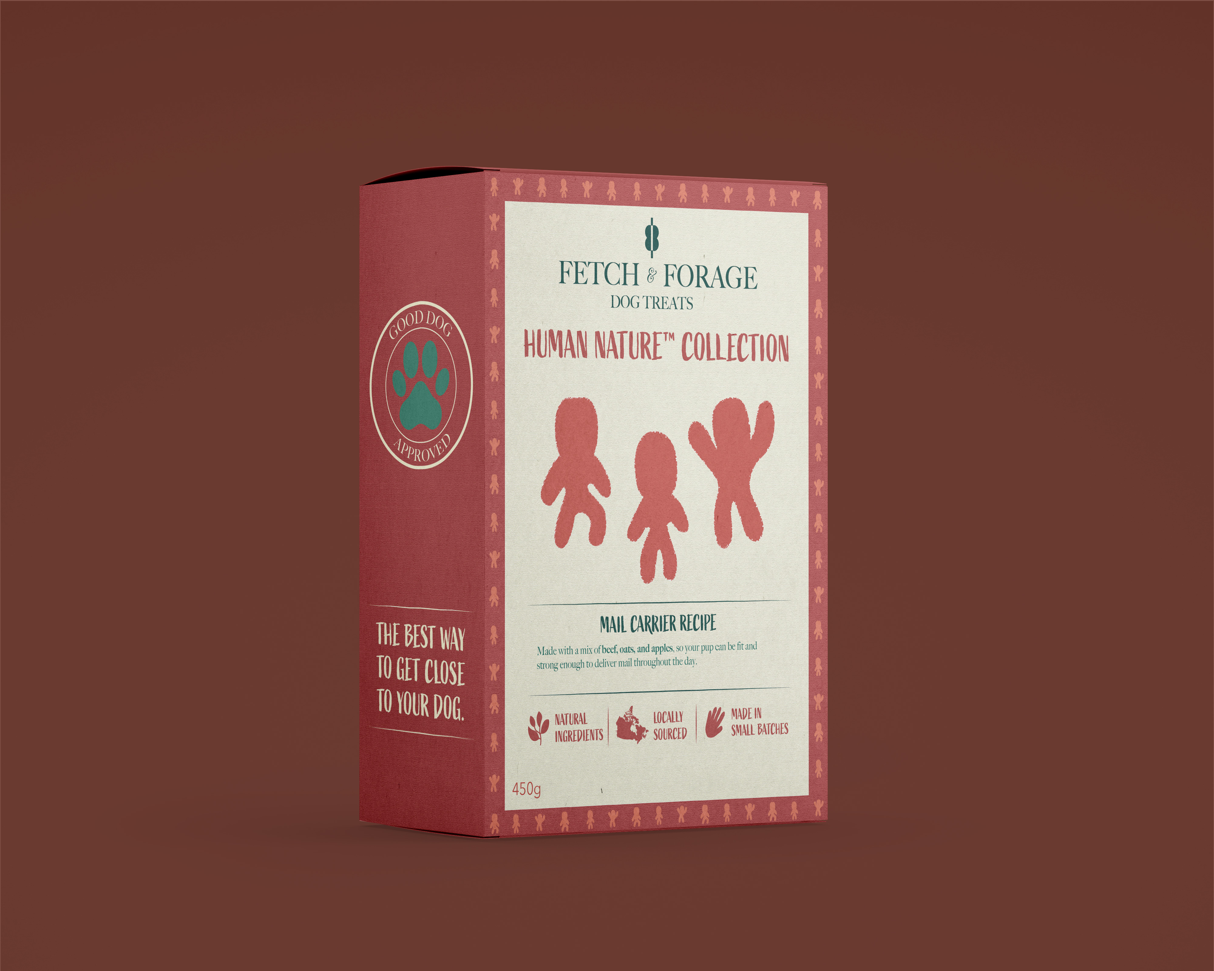
Fetch & Forage started as a really simple idea; I wanted to create a brand of dog treats that sells human-shaped animal crackers. It was meant to be a gag sort of product, one for people with morbid humour.
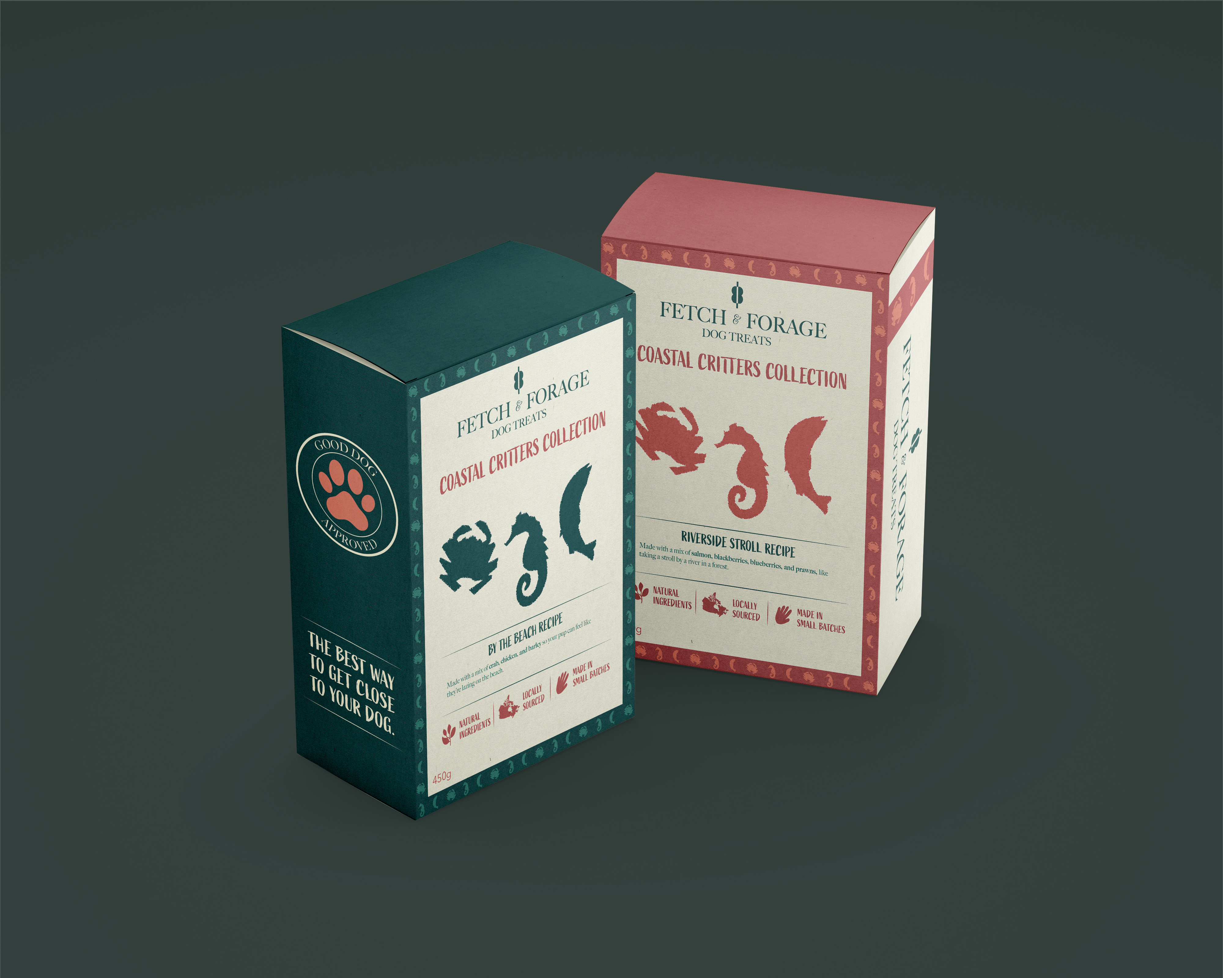
That's still true. However, when creating the assets for the brand, it evolved into a brand that takes itself seriously while having that humour underneath. It's supposed to be a paradoxical brand, meant to turn heads, while looking like a staple brand that's been around for ages.
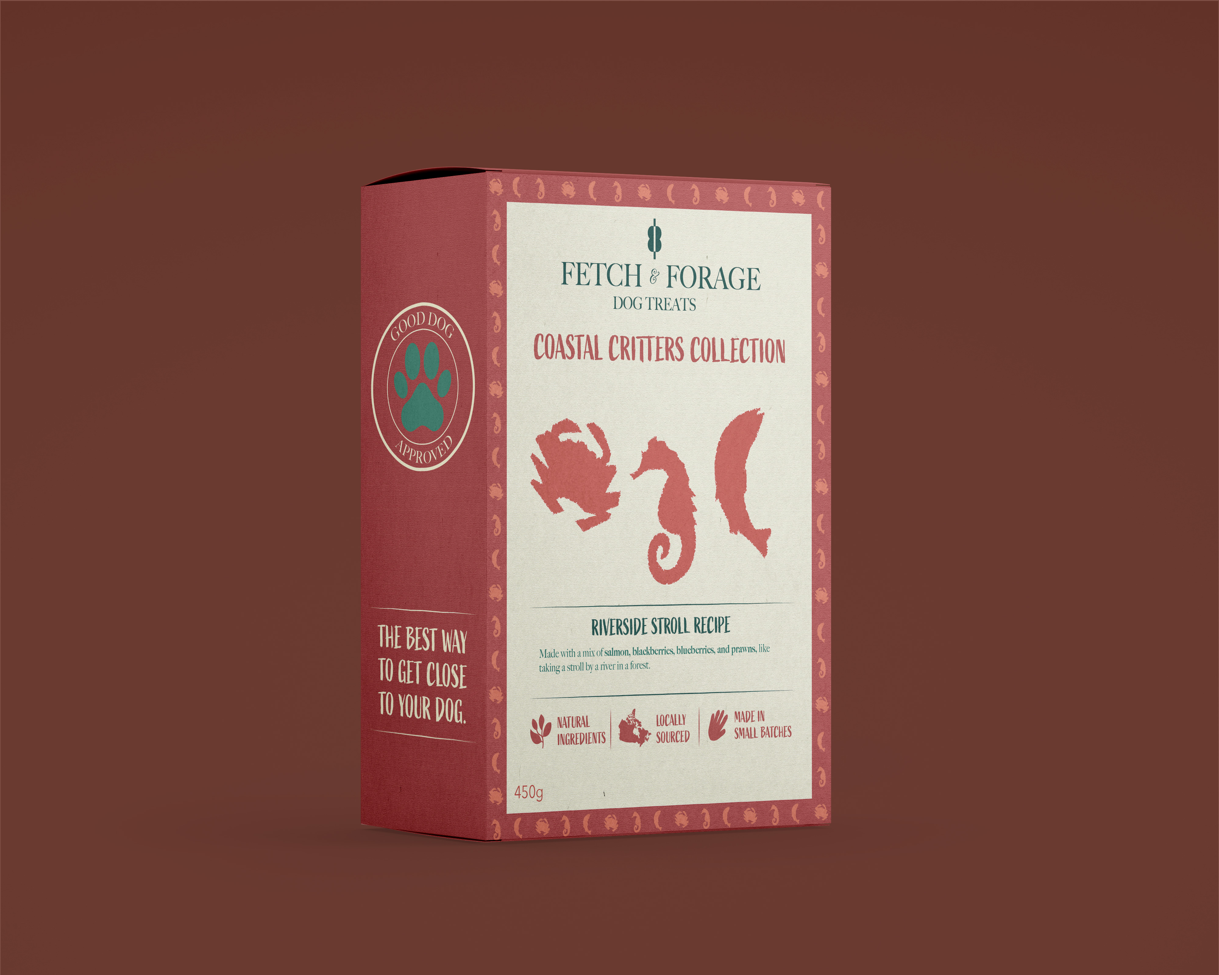
For my colour palette and the art style, I wanted something rustic, woodsy, and high contrast. This is where the beige, orange, and green came into the picture.
EVIDENCE:
"The best thing about Fetch & Forage is that it's a brand I would truly love to buy; it's one where the humour works for me."
VERDICT:
This is one of my favourite brands I've created. It's classy, bold, and refined.


.png)

