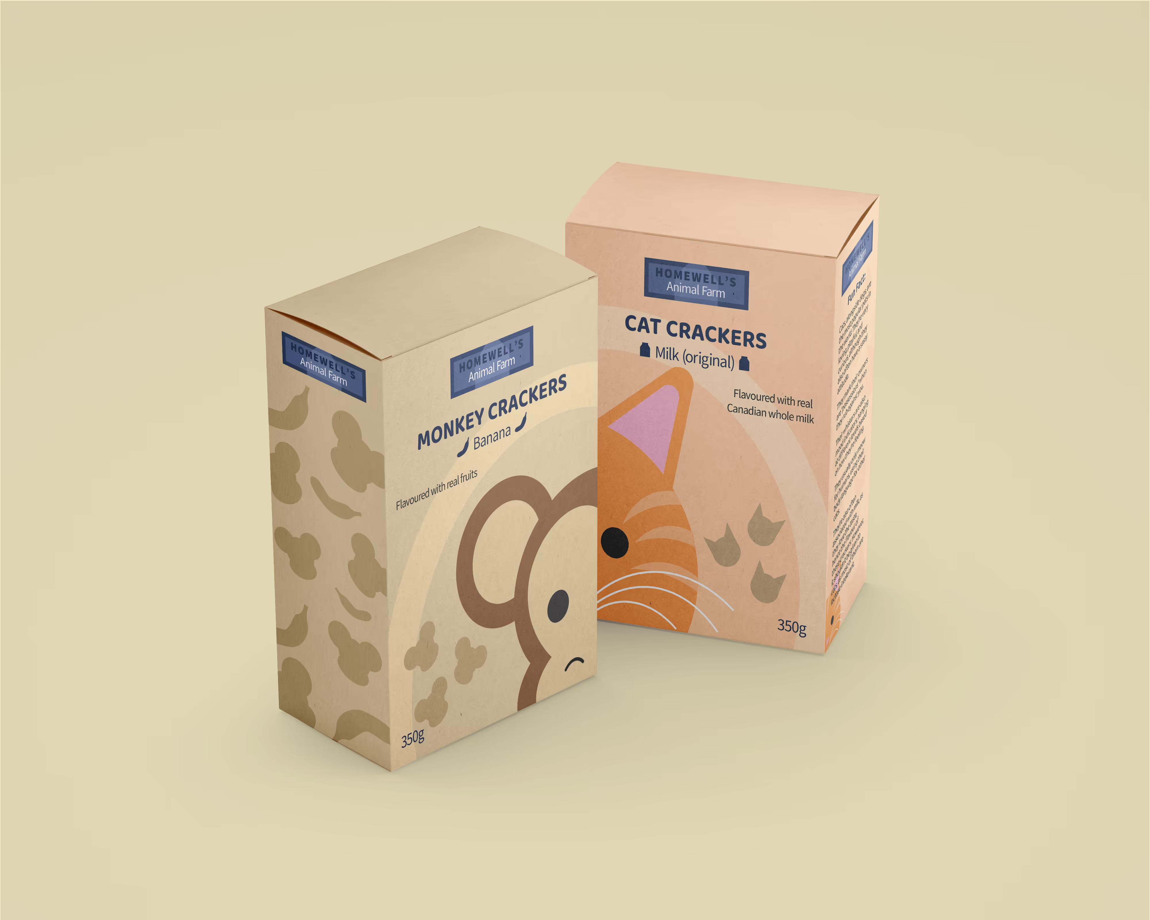
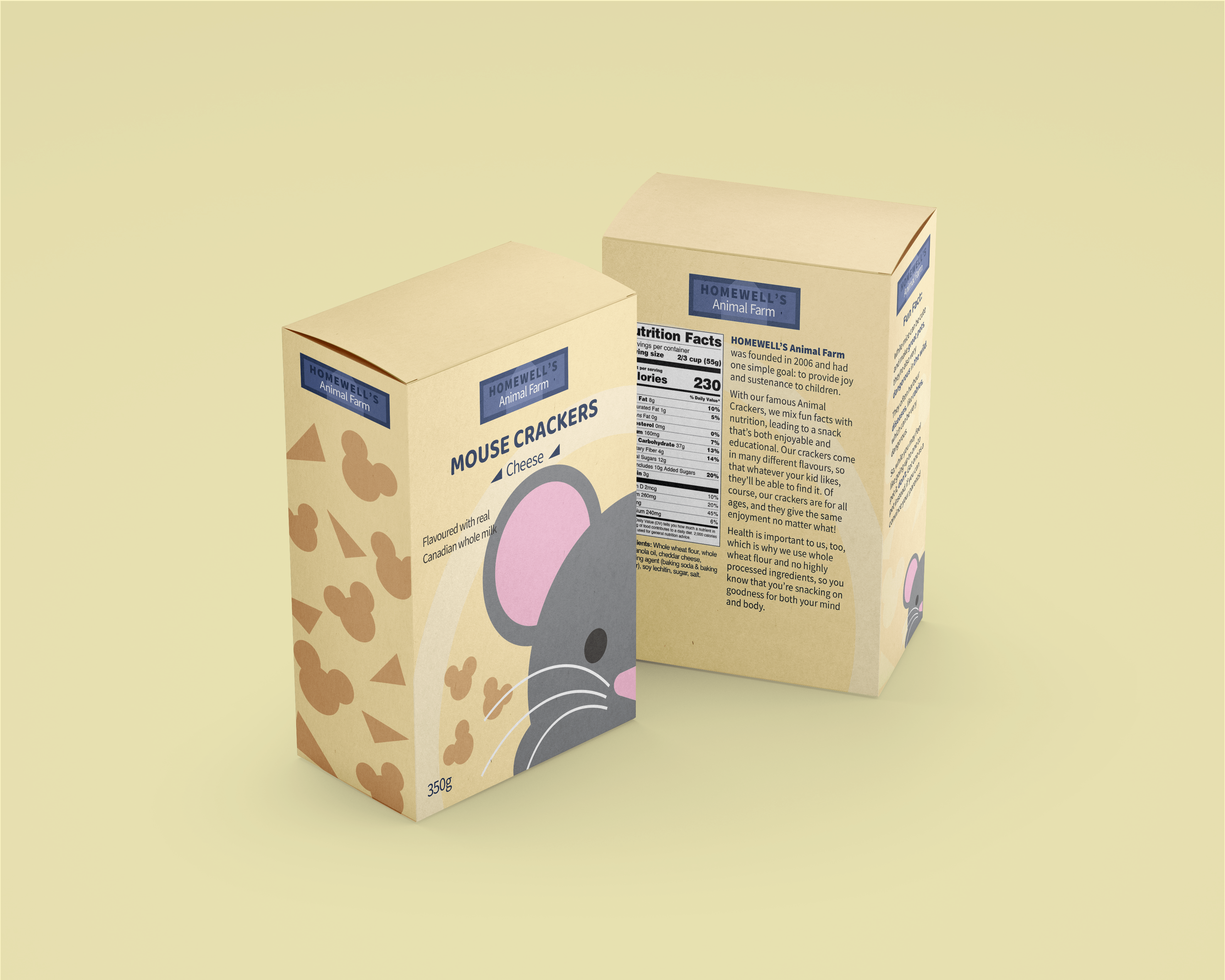
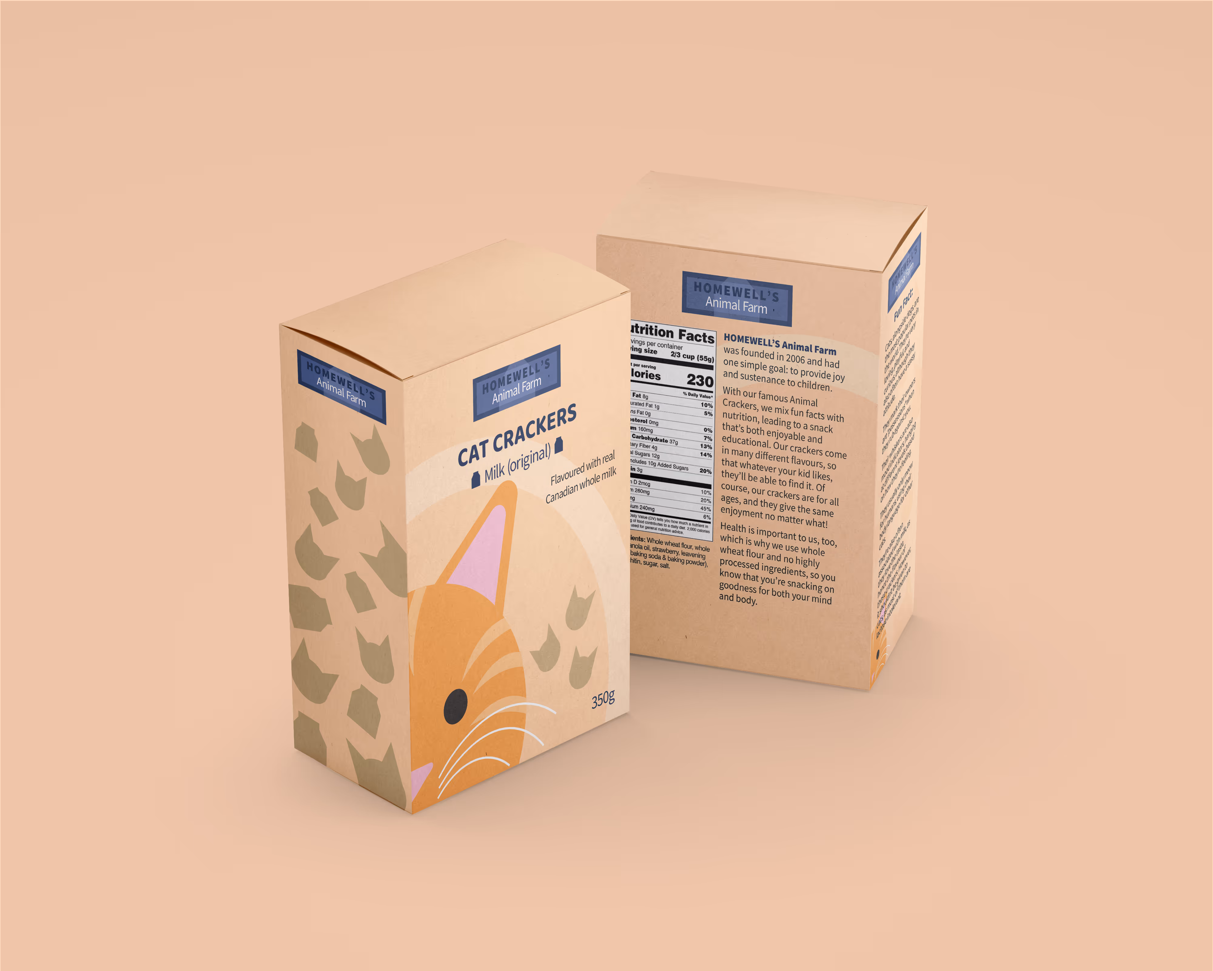
With Homewell's Animal Farm, my main goal was branding. I wanted to design a simplistic snack box for a popular product. I also wanted to put a fun spin on it.
In the end, I thought of animal crackers. How could I make them more interesting? So, I had the idea of making different boxes based on one specific animal, with the flavour relating to that.
The logo is a reference to Pepperidge Farm and other, staple food brands. It's meant to look timeless and like it's been in the business for a while, and the blue gives viewers a feeling of trust. For added engagement, the sides of each box fit into the next. This makes the shelf displays look more interesting and engages kids more.
"Snacks don't have to be boring. There's ways to turn a classic product into a compelling one."
I've always been really intrigued by animal crackers. I thought it was about time I designed my own, and I love the simplicity of them.


.png)