David Trusca - Art Director/Strategist Dani Perez - Art Director/Designer Hiu In Tsang - Designer Aryan Jolly - Designer/Web Designer
Objective/Explanation:
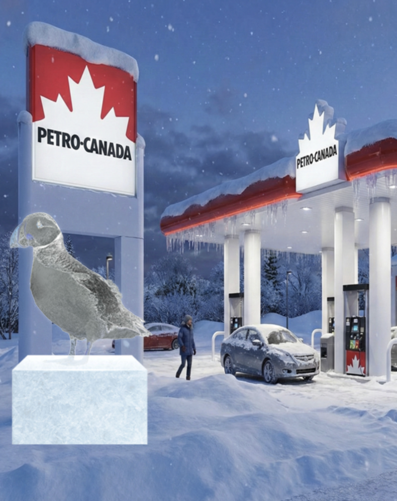
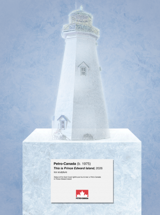
For this project, we were given a brief by Petro-Canada to create something with ice (their best-seller) that's culturally relevant and keeps Petro-Canada top of mind. They specifically wanted something that generates earned-centric media.
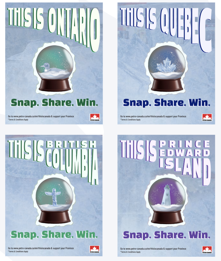
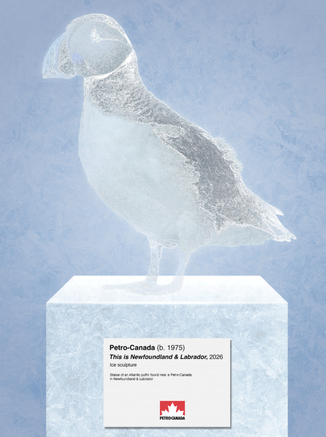
Our idea was simple for this: we wanted to make a campaign with ice sculptures, an important Canadian art, crafted into Canadian symbols. Each province and two territories would get custom ice sculptures at Petro-Canada locations in key locations crafted into important symbols to them.
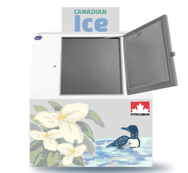
The idea also included a social media campaign, a custom, archival website, museum-style posters, and province-specific ice merchandiser decals.
"Ice is more than just a frozen state of water. It can be a way to bring Canada together."
This is one of my favourite campaigns I've ever made. The idea is so simple, yet I think it's still effective.


.png)